Emily and Jolynn have been working on some graphic design projects here in our office. The current project is updating the small Bright Lights binder.
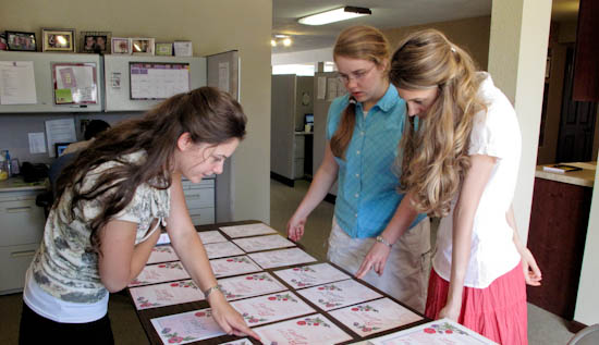 Emily has come up with about 50 different versions 🙂 but we now have it narrowed down to two!
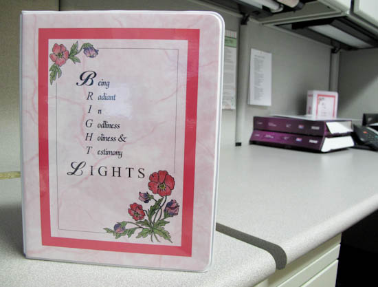
We need to order them really soon, but if you would leave a comment and tell us which one you like better, we would really appreciate the help. For reference, here is a picture of the old binder:
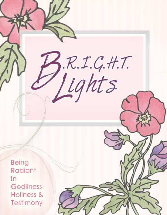
And here are the two new versions:
Which one do you like better between cover A and B?
(Also, if you have any additional suggestions or thoughts, feel free to share them.) Thanks!
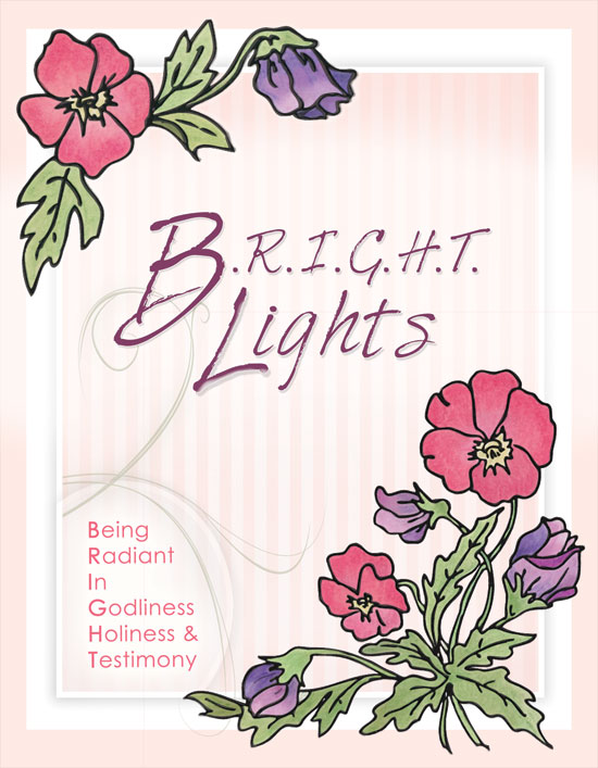
Both covers look really great! But I’m going to have to give my vote to Cover B. When will the new binders be available?
Hi Sarah,
Yay! First vote! 🙂 Thanks for your opinion.
I think the new ones should be available in about a month, hopefully!
-Grace
I also vote for Cover B 😉
This is so difficult. They both are great!
But in my opinion, I like Cover A, because of it’s soft colors.
Have a lovely day! xxxx~Kelsey
I’m a guy, but I like the look of B better. It’s cleaner and more readable – catches the eye a bit better.
I would agree and cast my vote for cover B 🙂
I vote for Cover B – although I really like them both. 🙂
I vote for cover B. I think that Emily and Jolynn are doing a great job.
I really love the new covers!! Especially Cover B 🙂
I don’t like either one. 🙂 Time for option 51! Okay, okay, I guess I vote Option A. 🙂
They are both great, but I like B best:)
Hope you are having a great week!
Blessings,
Becca
If cover A is hot and cover B is cold, I’m lukewarm:D
They both look really nice! Emily and Jolynn have done a great job with them. I’ll give my vote to Cover B. Two of my younger sisters also like Cover B better. One of them like Cover A.
I would have to say cover B. I like the brighter colors and the images aren’t “cut off” 🙂
The both are very well done. I like A better. With the muted colors on the flowers and the border around the title, my eyes are drawn more to the words on the cover than the design. But, again, both are well done.
I like the Cover B one the best! 🙂
I am actually going to vote for the old design! 🙂 I like how, in the old design, the words “Being Radiant in Godliness, Holiness, & Testimony” are centered. It just seems to proclaim the purpose of Bright Lights better than if the words were on the bottom left side.
I think I like cover B better, but they both look beautiful.
Hmmmmmm, I think……maybe………I really like conver B! 🙂 Both of them look really great! I can’t wait till we need to order more four our BL group! 🙂
🙂 Haley 🙂
Hi, I like cover B as well! Keep up the good work! x
Hey, They both are really good designs!! Good job Emily! I would have to say A is my personal favorite, but they both are really cool:)
Hi Grace,
I like Cover B the best 🙂
I like B. 🙂
Wow! That’s a hard decision! But, I think I am going to have to vote for cover B! 🙂
Blessings,
🙂 Natalie 🙂
Hmm, I think I like conver B the best!
🙂 Ana 🙂
I like B. Great job! 🙂
Ooh, I like the new design! I’d have to say I vote for Cover B. I really liked the old one too, though.
We both like Cover B because of the brighter, bolder colors! Thanks for your ministry!
It is a hard choice but I think I like Cover A. better. Either way I love them both!
Amber
I vote for Cover B! I think the striping in the background adds some texture to it, and the flowers are brighter. Love them both though!
Blessings, prayers and a hug,
Rachael
I Like cover B.
Cover B
I like the first one, because the Bright Lights stands out more with the boarder. 🙂
Definitely B! Its Great! 🙂 Could you put the acronym in a bolder pink so it would stand out more??
COVER B!
i like cover A but cover b is pretty to! 🙂
Cover B! 🙂
That is a very difficult decision. =) I love both. Maybe A? Because it’s softer and more feminine? But I really love choice B as well. The new designs are beautiful! Great work!
Blessings,
Elizabeth
I vote Cover B! 🙂
Great Job! I vote cover B! :0)
They’re both cute, but I like cover B better.
~Nadine
Beautiful work, Emily and Jolynn! I vote for Cover A. 🙂
I can’t wait until I turn 8! I like the second one better.
See you then!
~Naomi
(age 5-she is anxiously awaiting her 8th birthday when she can start attending Bright Lights!!)
I like cover B the best! 🙂 It ‘flows’ together more smoothly, in my opinion. 🙂
I prefer the first one, but they could make the
flowers clearer like in the second one. I really like the way there is a
“box” around the bright lights. But I like them both actually. :-} The second one does not look as faded, which I also like. ~KK~
Oh… Its fun to see Anna there as well! ~KK~
Cover B 🙂
I really love the old ones… but of the new, cover B is prettier in my opinion. 🙂 Both are very pretty, though! 🙂
Hello! Just to cast another vote, cover B does catch the eye a bit better and it’s quite pretty! So I guess I do vote cover B 😉
Sarah
I vote for A but they both look great!
I vote B. It seems so much more bright and cheery. It has cleaner look to it also.
They both are lovely…but I think option A is the lovliest! 🙂
I like cover A. 🙂
Both look great! I like option B the best.
Cover B.
I love cover B- it stands out more than A, and grabs your attention more that way. They’re both beautiful though- great designing, girls!
Cover B! 🙂
I like both, but Cover B is brighter (perfect for “Bright” Lights! 🙂 ) and I think that the background makes it stand out better. So I vote for B!
I’d say B, but I like them both. B looks a little clearer, I think. 🙂
Cover B! Love it!
I really like Cover B 😀
I like B better. The bright colors really stand out!!
I vote for B! I am very impressed with your ministry!
I vote for B!
Cover B is the one I’d pick
We like cover B best.
– Ruby and Amanda
We vote cover B!!!
– Ruby and Amanda
I would have to say…. Cover B! 🙂 It seems as though it flows better through out the whole page!
~Jenn
P.S. I LOVE bright lights…. it’s such a encouragment!
I LOVE cover B!! God bless!
They are both beautiful!! I think I’ll go with cover B but it’s a hard choice 🙂
Both are beautiful, but I think cover B is my favorite! Great job on the design!
They both look sooooo good! I really like B. That you for all that you have done! God bless!!
They are both beautiful, but I vote for cover B.
Weelll, I think both are nice, but I personally prefer cover A because the top flower is different from the old binder 🙂
I would pick B. Can’t wait to see it, and I hope to use it for a Bright Lights group someday!
Schuyler
Beautiful covers!!! My overall favorite choice is B… but I really like the softer colored flowers in A, and that the flowers are “cut off.”
Good job Emily and Jolynn! God Bless!
I like cover B best! I really like the old one though!!!
The Lord bless you!
Christa
Hello again!
I just thought I’d add that I really liked the bright colors on the old binders. Just curious, what made you decide to change them?
~ Christa
I like cover A best! Christa thinks the same thing. She changed her mind again! :O)
Amanda
I like cover B. but I also like that on cover A Bright Lights is typed in a box.
Cover B wins my vote! Nice designing…..
I like Cover B! The white border makes it different and pretty 🙂 I still read this blog now and then, and it’s fun seeing Jolynn in pictures! I miss all of you a lot and you have no idea how often you guys come to mind. God bless! ♥
Definitely cover B!!! Looks great, Em!
Hello Mallys! I like cover B the best. It’s a nice blend between the old look and the new look. The white border adds a nice touch, too! 🙂
Cover B 🙂
“Sorry “A” but I personally think “B” looks better .
Nothing personal !! ” 😉
I have to say, I miss the days of calligraphy! These are very pretty, though.
I prefer B, mainly because the acronym is inside the border. In A the border draws the eye to “Bright Lights” so much that it’s easy not to notice the acronym, which I think is much more important than that design suggests. I also like the style of the border in B better (depth, and white more than gray).
Definitely B. To me it looks more polished, and I like that the flowers are brighter and not as big. I’m very excited about a new design!
B!
I vote cover B. 🙂
Hee hee, just cause you need another opinion – I vote for binder B because it is brighter and seems to match our BL brochures better. 🙂
Have fun choosing! I am laughing knowing what the office sounds like as you decide.
Love you all! Mary
I really like cover B!!!
I would have to agree with Natalie, who said:
“I am actually going to vote for the old design! I like how, in the old design, the words “Being Radiant in Godliness, Holiness, & Testimony” are centered. It just seems to proclaim the purpose of Bright Lights better than if the words were on the bottom left side.”
But I guess of the two given, I like Cover A better, because it brings into focus the BRIGHT Lights title.
Mom likes A 🙂
I prefer cover B also LOVE IT! I like the acronym in the center and then the acrostic spelled out on the side. I agree with one post regarding a bold bright type on the corner, but it looks GREAT!
I like the darker print on A, but the smaller and darker floral design on B.
I have to say I like B the best, but they both look great! I’m excited about the update 🙂 Great job!
I like cover B better. 🙂
I like the striped background on cover B, it adds more texture. I do like them both they are very beautiful!
If I had to choose I’d choose Cover B 🙂 looks like most everyone is choosing B 🙂
I like cover B 🙂
My sister and I like cover B (although they both look nice). The colors and border accent it nicely. Good job!
cover B
!!!
They are both so beautiful! I am gonna go with…hmm..cover B!
I had the chance to be at the Radiant Purity conference in Rockwall, TX in June 2011. I was so convicted by it. You have an amazing ministry, Grace and Sarah.
BTW: I LOVE Sarah’s new book “Before You Meet Prince Charming”. I can’t wait until yours (Grace) comes out 🙂
LOL–because it seems the popular thing to do, I’ll comment on this blog post too. I can’t recall the last time I saw so many commments on one post!
Hi to the fellow Karissa! 🙂
Oh, and I’ll cast my vote for the unpopular Cover A. I don’t like stripes.
**oops! Meant to add that they are both lovely, despite my disregard for stripes 🙂
Cover B is my vote, though they both are nice!
Definitely Cover B. I like it a lot.
I really like them both, but I think I’m going to vote for cover B!
Definitely “B”…. 🙂 So excited for my daughter starting Bright Lights!! 🙂
I like them both, but I like B the best.
Annie Jones
I love cover B. Brighter colors, more pink so seems more vivid. Love the darker pinstripes in the background. New font looks nice. Cannot go wrong with either one.
My Mum,sisters and I like cover B. 🙂
Cover A
My thoughts are that cover A is much cleaner without the extra border around the outside which directs my eyes to the words and sparks my curiosity as to what they stand for, which directs my attention to the corner where they’re spelt out. (So just fyi to who I am, Laura Weieneth was my roommate last year and I just graduated from the College of Design at Iowa State.)
I like Cover B better! The flowers are clearer and the fading border all around looks lovely.
Great work, girls!
Cover B. The colors are so rich.