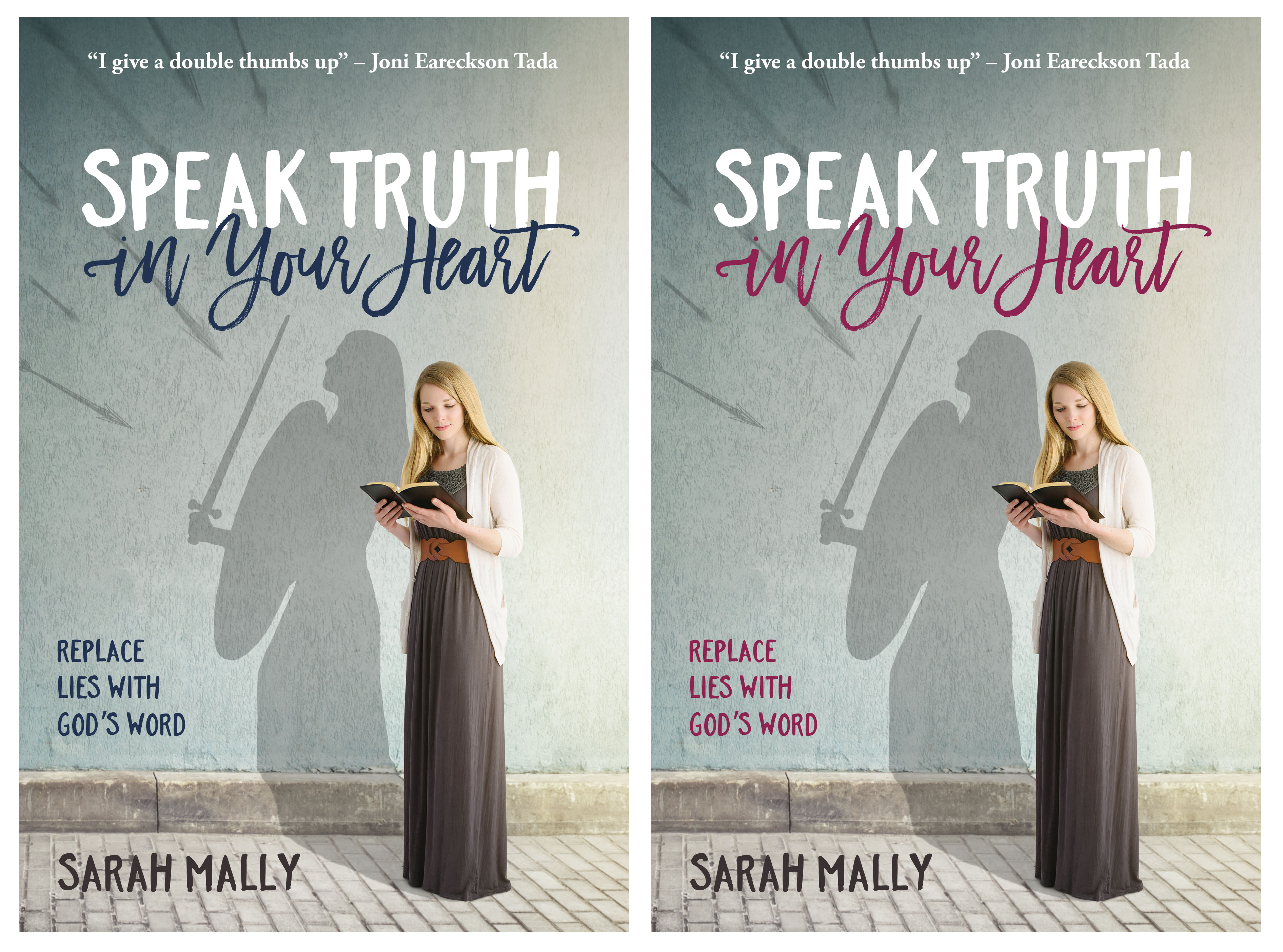
Please leave a comment if you would like to help us with a last-minute decision for Sarah’s new book cover. Which color do you prefer for the title: navy or cranberry? Feel free to share why, if you’d like. It will be sent to the printer this week, Lord willing! We are excited to be so close to the finish line. 🙂


I like the cranberry much better. The rest of the book is in cool colors, so the red-purple brightens it for a good balance.
Congratulations on finishing, Sarah! I own and love all the Mally family’s books!
I like cranberry better. I think it looks more feminine : )
I love the cranberry, too! Can’t wait! ?
Cranberry is best!
I love the cranberry color. It helps the “in your heart” to stand out, and it just looks beautiful!
Hard choice… they both look nice, but I like the navy best? either way, i’m looking forward to reading it!
Cranberry!! Definitely marks it as a book for girls and gives it a more energetic feel!
Looks great!! Congratulations to Sarah and her team!! ??
I love cranberry! Looking forward to reading it! 😀
Oh, they are both beautiful.. either way, although I do lean a bit more towards cranberry. It is quite contrasting and has very pretty appearance with the other colors. I am SO EXCITED to buy the book! ??
I like the cranberry More. It stands out.
I like the cranberry because looks more like an action oriented color. We will look forward to reading it no matter what the color!
Yes, I still vote for the “cranberry” one. But you can’t go wrong with either one!
I like the cranberry more. The navy kinda gets lost I think, and doesn’t stand out as much as the cranberry. ?
I like the navy best, but that doesn’t sound like popular opinion, so cranberry would be nice too. 😉
I like both colors, but the Navy looks better to me. Not quite sure why. Just seems to go better. 🙂
I vote Navy! 🙂
The navy blends more with the overall color theme, and it also makes “SPEAK TRUTH” (which is the main concept) stand out more…whereas the burgundy is lovely but detracts from the SPEAK TRUTH.
They both go so well but I think the cranberry makes it look brighter.
I like the cranberry color the best. It is bold and stands out more than the navy color. I’m excited to get this book!
I really like the navy, but I do think the cranberry stands out more and is more feminine. Plus it’s more of a “heart” colour. 😉 I think they are both lovely though!
I’m just SO excited for this book!!!!! Praise the Lord it’s nearly done!!! 😀
I love the cranberry!
Cranberry! 🙂
The navy technically matches better, but the cranberry adds an extra artistic touch to the cover.
Red for the heart!. Can’t wait to read it Sarah
I think the cranberry color gives the cover even more visual interest. I love the look! It’s funny, though, because I like the navy better for the sub-heading in the bottom left corner. Call me undecided. 😛
Cranberry. It’s more feminine and it’s stands out more.
Definitely the cranberry! Very feminine and makes the whole cover stand out!:) Can’t wait to read it!
The cranberry draws more attention to the girl’s face, and provides more contrast, which draws attention to the words. Looking forward to this helpful book!
They both look great but I do feel that the cranberry does make it stand out more! 🙂
You guys are doing a wonderful job and I praise God for the ministry that He has given you. Every blessing in Jesus! 🙂
I really like the navy. I think that it goes better with the color scheme and doesn’t stand out as much! I think the red stands out a little too much and kinda distracts from the other stuff on the cover!
I think the cranberry looks best! Looking forward to reading it!
We LOVE the “shadow” in the background. What a beautiful cover! … We think cranberry, too, although both colors look really good. So excited about this book! ! !
Cranberry by far. Love the cover design really pretty!
Also, is this based on the Speak Truth in Your Heart Conference?
God bless,
Emma
Both colors look amazing, but I vote Navy. I think it definitely goes better with the overall cover and looks more uniform. Either way, I will definitely buy a copy!
The Navy is sophisticated & classic
I suspect you will choose the cranberry though – it’s younger & fun but it doesn’t work anywhere near as well. Have you considered a tan similar to the belt the girl is wearing?
I like the cranberry. It stands out more and looks more femenine.
The navy blends better overall. When I saw the cranberry my first response was to see if there were any other hints of that color anywhere else. While it’s a lovely color, the navy fits in the overall scheme better.
Love the cover design. I like Cranberry 🙂
I showed mom and my sisters the cover and instantly they all said cranberry! I don’t know, it just “fits” the theme of the cover and gives it a pretty accent. 😉
“I’m so excited for this book!
Navy!!!! Definitely navy!
Totally Cranberry! 🙂
I love the cranberry!
I like the cranberry best except that it clashes with the girl’s belt.
Thanks for writing a book on such an important subject!
The cranberry jumped out at me first.